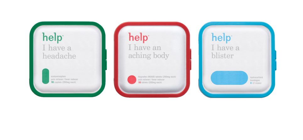


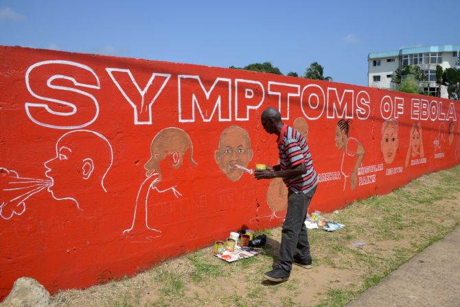
A cigarette oozing fat. The clinical white glow of a pillbox. The distant green of a pharmacy sign. We might overlook it, but graphic design plays a major part in our perceptions of health and medicine. Through imagery and information, designers can have a massive effect on public health, helping us to identify symptoms and break bad habits.
Delving into this relationship between health and aesthetics is a new exhibition called “Can Graphic Design Save Your Life?” at London’s Wellcome Collection, which examines everything from medical packaging and public health campaigns to historical artifacts. While it might sound like a niche meeting of worlds, curators Lucienne Roberts and Rebecca Wright (a designer and educator respectively) found a wealth of diverse material at this intersection.
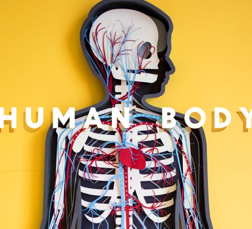
“One of our intentions with the show was to portray the variety of design and communication strategies,” explained Wright. “There are some really playful examples … In the education section, we have some children’s pop-up books where show us all about the human body. They are very accessible, very colorful … but we also have plague notices from the 15th century and cholera broadsheets.”
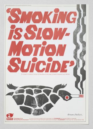
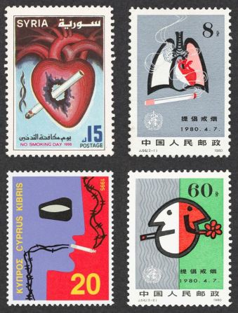
The exhibition is divided into six themed sections. The first, persuasion, focuses on smoking, and how graphic design is as responsible for the proliferation of smoking as it is the fight to discourage it – as evidenced by a concerted international movement toward plain cigarette packaging.
“(Smoking) is one of the areas where the power and influence of graphic design has been recognized officially,” said Wright.”The World Health Organization chose the packaging and branding of cigarettes as a key battleground … So by legislating against the use of graphic design, it kind of elevates the power of graphic design.”

While much of the aesthetic language around health is about making people feel safe, clean, well-looked-after and informed, fear is a common technique that health bodies and medical companies use to grab people’s attention. While some campaigns and logos make you feel better about yourself, others warn of an imminent danger of various lifestyle choices.
“Probably the most effective adverts are the ones that are most terrifying,” says David Rosner, a professor of sociomedical issues at Columbia University. “The Legacy Foundation – now the Truth Initiative – was particularly impressive with their body bags in front of the Phillip Morris building in New York.”
(As part of its “Truth” campaign, the American Legacy Foundation, a non-profit that aimed to discourage youth from smoking, launched a commercial that showed youth piling body bags – representing the 1,200 people killed by tobacco daily, per the Foundation – outside of the American tobacco company Phillip Morris’ New York headquarters.)


How design and healing go hand in hand
Wright and Roberts also explore how the look of our hospitals and medical facilities reflect public health priorities. Roberts found a featured project by design consultancy Pearson Lloyd as particularly interesting.
“They answered an open design challenge from the UK Design Council and the Department of Health to see if they could reduce violence in A&E (accident and emergency) wards. Through their research, they identified that one of the biggest sources anxiety and anger in A&E is the lack of information … so their solution was based in information design. Violence in the departments they piloted their designs in reduced by 50%, so there’s evidence that graphic design can have a really tangible impact on health.”
But as well intentioned as clever public health campaigns might be, Rosner, has doubts about their broader effectiveness.
“I generally worry that these campaigns make us in public health feel good, but are not very effective in shaping public behavior in the face of industry efforts to convince people that they should smoke, eat fast food and drink alcohol. The cute little toad that accompanies beer commercials during football games is much more effective in promoting alcohol than any ads about liver cancer,” he said.
“Public health posters are only effective if they’re coordinated in a much wider educational effort that involve children, into adulthood. Even then I think that alone they probably are marginally, if at all, effective in changing behaviors.”
But clearly, some of these notices do resonate with people. Roberts cites the Scottish government’s 2008 “Kill Jill” campaign to encourage people to register for the organ donor register. Designed by The Union, an Edinburgh marketing agency, it included posters, TV spots and field marketing.
“‘Kill Jill,’ and is less about fear and more about taking responsibility,” said Roberts. “You see a picture of a child and you’re invited to make a decision about her life, depending on if you donate organs or not. It led to a 300% rise in organ donations … The TV ad had many complaints, but its effectiveness won over.”
“Can Graphic Design Save Your Life?” is on at the Wellcome Collection in London until Jan. 14, 2018.