


Editor’s Note: Read more unknown and curious design origin stories here.
Even if you’ve never heard of it, Helvetica has been part of your life. This typeface is, very literally, everywhere: computer screens, billboards, buildings, street signs and posters.
Look around you. It’s likely that some manifestation of Helvetica won’t be too far away. Since its launch in 1957, it’s become the go-to type for company logos and transport hubs, making it one of the most widespread designs of all time.
But like every icon, Helvetica divides opinions, and many designers consider it unoriginal, uninspired and unattractive.
So why has it ruled the world for more than 60 years?
The right name
“Helvetica has a complicated history. In fact, it was not called Helvetica until four years after its release,” American designer and design historian Paul Shaw explained over the phone.
It started its life as “Neue Haas Grotesk,” a boringly descriptive moniker which included the name of its maker (the Haas foundry), its design type (neo-grotesque or realist) and the fact that is was new (or “neue” in German).
“The original name sucked,” said Shaw. The name Helvetica, which means “Swiss” in Latin as a homage to its country of origin, was adopted in 1960 to make it easier to sell it abroad.
And so it did: “Helvetica gets its first kick because the Germans come up with a great name and make it available in the two mechanisms of the day, machines and foundry type, so that anybody could buy it.”
Its design wasn’t original: Helvetica was born out of a typeface from 1896 called Standard in the US and Akzidenz-Grotesk in Germany, which had been used as the avant-garde typeface from the 1920s, especially in Switzerland.
“Standard as a name was brilliant, but it also caused problems, because people started saying ‘We’ll just use the standard typeface’ and those who were not designers took that literally to mean whatever we’ve been using for everything else. That’s how Helvetica accidentally slipped through the cracks,” said Shaw.
The right look
Helvetica’s creators, graphic designer Max Miedinger and his boss, Eduard Hoffmann, wanted a neutral and versatile design. It had to be a modern-looking “sans-serif” type, without the extending features at the end of strokes that were common in the print world.
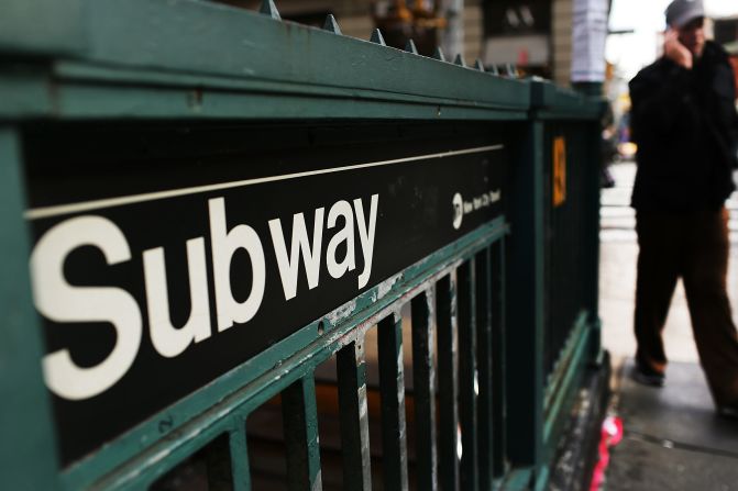
Its lack of personality was not just intentional, but paramount. Legendary designer Massimo Vignelli, who used Helvetica for the New York Subway system, said in Gary Hustwit’s eponymous 2007 documentary: “There are people that think that type should be expressive. They have a different point of view from mine.”
Its mix of features, or lack thereof, happened to be exactly what designers were looking for: “Helvetica showed up at the right place, the right time,” said in an email Ellen Lupton, curator of contemporary design at the Cooper-Hewitt, Smithsonian Design Museum in New York.
“It provided something that designers wanted: a typeface apparently devoid of personality. In contrast, other popular sans serif typefaces that existed at the time, such as Gill Sans and Futura, have stronger voices and more distinctive geometries. Helvetica met our craving for corporate vanilla,” said Lutpon.
The right brand
Helvetica wasn’t an immediate hit in Europe, although it was available there first.
Famed designer Bob Noorda doesn’t use it for the Milan metro signage, choosing his own version of the Standard typeface instead: “He could have used Helvetica, but he didn’t, and neither did the Dutch for Schiphol airport. Helvetica just didn’t have the cachet it has today,” said Shaw.
But it didn’t take long before it became the standard for advertising and corporate branding in the US: “In 1967 it creeps into the design for the Yankee Stadium,” said Shaw, “And by 1968 it’s everywhere in America – it is the typeface.”
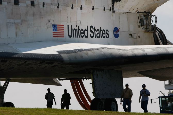
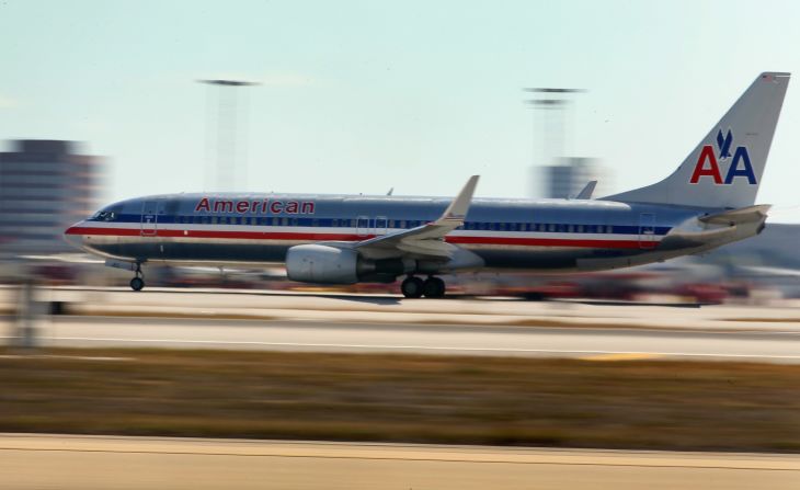
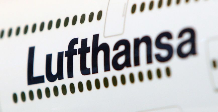
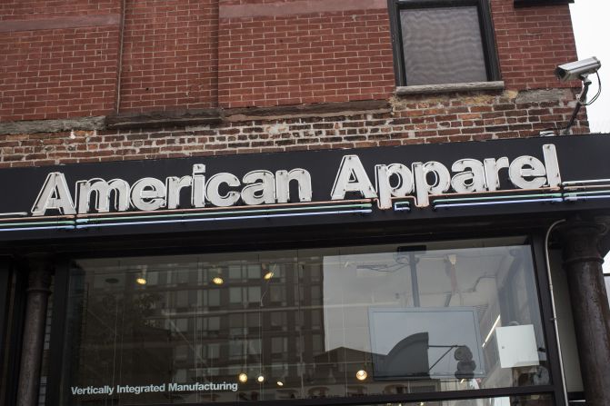
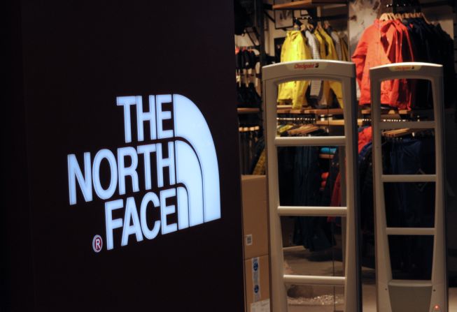
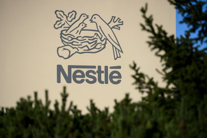
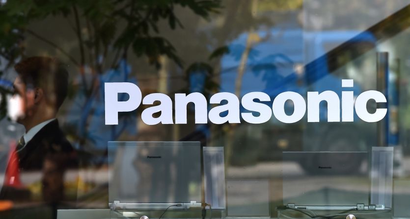
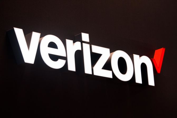
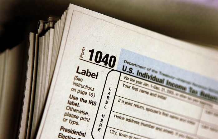
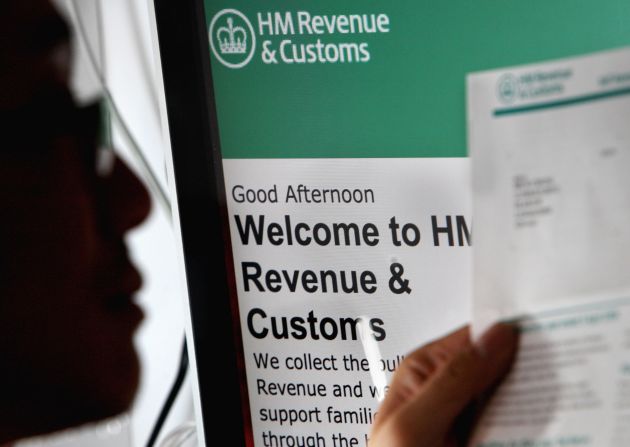
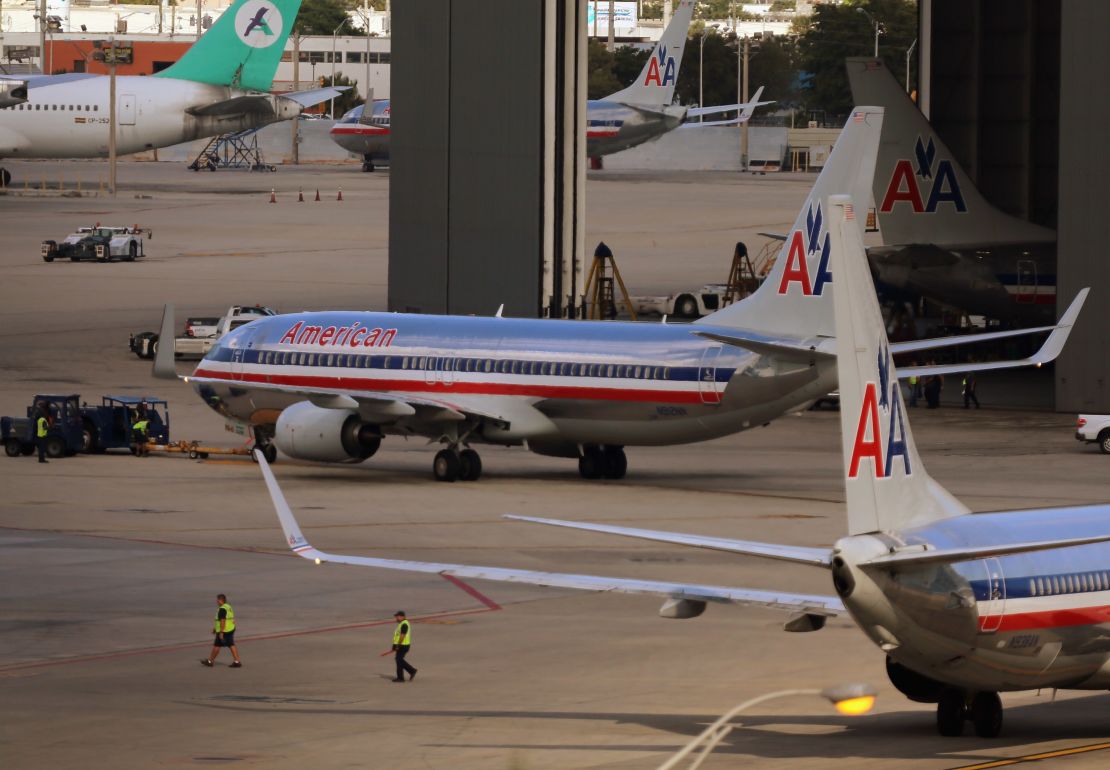
Vignelli chooses it for the American Airlines logo, which will remain untouched until 2013 – one of the most enduring corporate identities of the 20th Century. It ends up – sometimes with minor variations – in countless company logos including those of BMW, Crate&Barrel, Fendi, Jeep, Kawasaki, Knoll, Lufthansa, Mattel, Nestlé, Panasonic, Scotch, Skype, Target, Texaco, Tupperware, and Verizon. NASA paints it on the side of the Space Shuttle. The US government redesigned its tax forms with it.
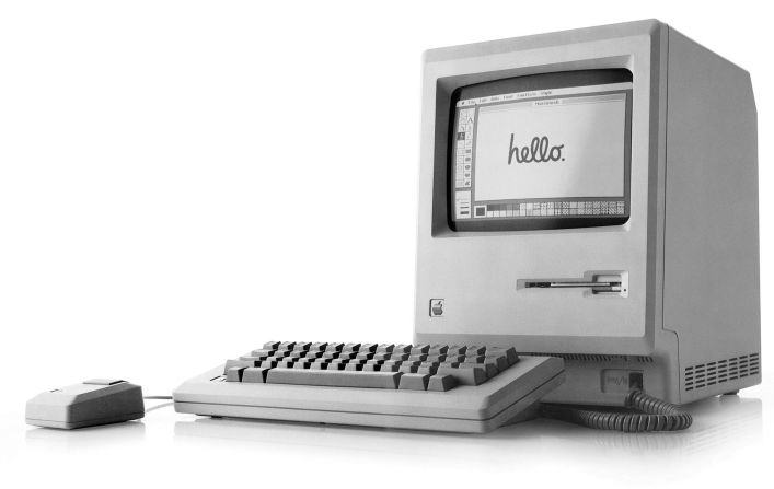
In 1984, Steve Jobs puts it in the Macintosh: “This was a key move. If Apple didn’t use it, Helvetica would have remained a designer’s preference, same as Times New Roman. Instead, it becomes the default sans serif when sans serif fonts are becoming popular among the populous and not just avant-garde designers,” said Shaw.
Finally, in 1989, Vignelli and Noorda adopt it for the New York Subway system signage, moving on from Standard.
The world is conquered: “It’s air, you know. It’s just there. There’s no choice. You have to breathe, so you have to use Helvetica,” says influential German typographer Erik Spiekermann in the documentary “Helvetica.”
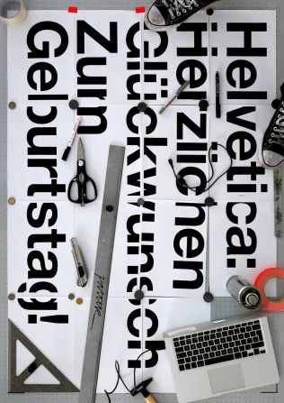
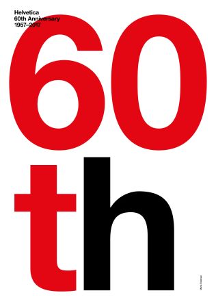
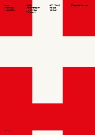
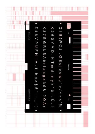
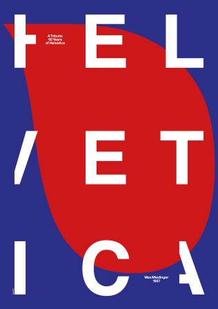
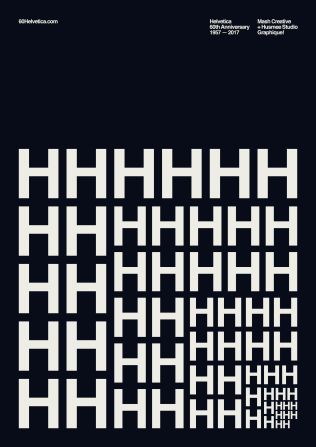
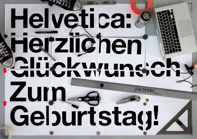
Poster collection celebrates 60 years of Helvetica
The right species
The popularity of Helvetica continues today. It was the system font on the original iPhone, and it remained part of iOS until 2015, when Apple replaced it with its own San Francisco.
It continues to inspire: the font used in this article and the rest of CNN’s website is a close relative of Helvetica called CNN Sans. Microsoft’s knockoff of Helvetica, called Arial, is one of Windows’ most popular system fonts.
However, it’s not easy to get a kind word on Helvetica from designers: The fact that people didn’t feel passionate about it in retrospect is interesting,” said Shaw, “It’s not a terrible typeface, it’s just heavily overrated.”
According to Shaw, there was not a lot design-wise that made it better than either Standard or Univers, its great rival that was released in the same year.
“I am not a big fan of Helvetica, but I admire its ability to spread and take root worldwide,” said Lupton.
“It is an invasive and drug-resistant species that may never be eradicated. Even designers who don’t often use Helvetica in their own work take pride in the fact that it is such a persistent cultural icon.”